Saturday, November 26, 2022

Retirement Gift

At the start of my life as a weaver, well, actually a bit before that when I wasn't weaving much but trying to imagine what life would look like as a maker as opposed to an office worker, I had a couple of lists which I kept for a couple of years. One was a list of words/phrases I hoped would describe my weaving: elegant, exquisite, expensive-looking, fine threads... I don't remember much else, but it had up to a dozen words; I occasionally changed it, and I occasionally ran a mental check of a planned project to see if some of the words applied. I didn't cancel the plan even if it didn't, because "fit for purpose" was a higher priority, but it gave me a vague sense of direction or "shape" in this brave new world where every single decision was mine. 
 
Another list was scenes/occasions I imagined where my pieces would appear. Birthday/holiday present, collage graduation present, first-paycheck/Thanks-Mom present, wedding present, anniversary present 10th vs 20th, (because back then I thought being married for 20 years was such a big occasion towards, ahem, the end of one's life!) And then it got more involved: 
 
* Is this a date or isn't it? - First walk on the beach; she is wrapped in a not-new piece; emotional shield??
* Work night date - urban scene; she is running in heels and work suit; dusk, possibly raining; a special night for a professional couple. 
* Couch/TV - First staying-in date. Rom-com? Foreign language? Conspiracy? SciFi? Who's choice?
* Couch/foot rub - another big family celebration successfully hosted; everybody's gone home; dishes done; vacuuming tomorrow. Watching and not watching late-late-night B-movie, quietly together, but basking in the moments of the day separately.
* Dignity/Nostalgia - nicely dressed older woman at the head of a long table on a family occasion, possibly autumn, wearing a piece given to her many years ago. Does it look somewhat dated, or ageless? Widow??? 
 
You get the picture. I had loads of these vivid pictures, and they not only helped me plan, but made all the steps in weaving fun, because I could see and feel the cloth. Now that I've written about it, I have got to return to this method, rather than getting bogged down with values and drafts and such which feels all so... impersonal. 

Anyhoo, I was in my early 40s and the majority of protagonists were... 30s/40s, and their bodies were lighter and spirits brighter. 

In the decade I sold my work through galleries, gallerists were very kind in letting me know whatever they knew about the purchasers, and in some cases, their purposes. I discovered many were as souvenirs from New Zealand, either for themselves or someone else, so I started specifying "NZ wool" and "NZ merino". Besides, my prices are more affordable when converted to many foreign currencies.

Of the pieces purchased by Kiwis though, via galleries or from me directly, an overwhelming majority have been as leaving/retirement presents, and those responsible for purchases representing a group, the inquiries/correspondences are slightly more involved. And I love it! I get to share a little bit about how I designed it, the characteristics of the cloth, (you know me, "sleeping baby", "big dog leaning on your leg", "wet". That stuff.) It's so hard not to be too gushy. And now I've reached retirement age had I stayed in office jobs, I have been feeling an especially warm connection to purchasers looking for retirement presents. 

A recent purchase was for a nurse who started working right after she finished nursing school. I picture a woman about my age. I picture her working at a selfless, honorable job while I was fluffing around at college, fluffing around at office jobs, and fluffing around at home experimenting with "being a weaver". But most of all, I think of the last three horrendous years at the end of her career. And not just her, but her colleagues, the entire profession, including the person who got in touch with me after an image search. It's been a very humbling few days.
Retirement; not retirement; retirement.

Friday, November 25, 2022

Purples

I've always liked purples, on the blue side, pale and dark, though I don't recall friends/family telling me they liked it, too, until I got older. In the last year or so, I've had three inquiries about purple pieces. So is it more popular now? Have you looked for, or had inquiries? 

The piece sold from the shop page this week was an interesting one. And I'm going to confuse you a little because a) the photos don't demonstrate well what I mean, but I didn't want to manipulate them to make a point, and b) I'm not separating the idea of a piece of cloth looking "more" purple; from another idea of the cloth "popping with colors", i.e. not looking flat very well. Sorry. But I'm in a rush to put down these thoughts before I forget. 
 
I couldn't remember what I used in the warp, I had a very close look when I gave it the last steam press. It turned out I used the same 30/2 merino in the warp and the weft, and for the warp I paired navy blue with medium blue, lighter blue and a medium-light green. (So every other warp end is navy.) I made stripes with these three "colors", though I couldn't remember the order, nor whether the stripes were uniform in width. (To be honest, it's a really rare thing that I can't remember making any warp.) 
 
I can't remember if I made the draft for this warp, but it's more likely I recycled one, or modified an old one to fit the width of the stripes, because, how do I describe this, the center of the pattern stripes seem to sit in the center of color stripes. The weft in this piece is hot pink. 

What I discovered, though, I'm not sure if I can convince you from lat my photos, as I said, but it was a surprise and a lesson to me.
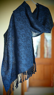
From memory, this is a view of the piece hanging on my front doorway on a sunny day. 
This is taken inside the house, away from the outside sun, and the color maybe closer to real life. Though the same yarns, the mid- and lighter-blue and the green shimmer in real life, which is why I had to make sure the warp was merino, and not possum/merino/silk. The current header photo at the top is of the same piece, too.
 
The issue was, the customer was looking for a purple piece, and I had none, but she was interested in this, and if it proves unsuitable, could she exchange? I informed her this is more hot pink, but with the blues in the warp, had an overall purple appearance. I had nothing else close to purple, and nothing similar in style/price, so I would be happy to refund, but could not exchange. 
 
I might have stressed the fact it's hot pink, because I didn't want to surprise when the parcel was opened. (I guess it also reflected my prejudice against hot pink; I expected others to be shocked. Although I'm the one who chose to weave with it, and it's not a bad combination... Just... pink.)  

I thought that's when the conversation ended and it was up to her to decide. Then Ben came home, and he pointed out: 1) it's not a bright hot pink, but a darkish one; 2) because of all the blues in the warp, the overall look is purple, possibly a more "animated" (my word,) purple; and 3) depending on the person, it might be a good "cheer me up" piece.  So I sent her one last email, clarifying I didn't want to pressure her, but here was another point of view from another pair of eyes.

When the piece is in movement, (I often do this gentle swaying of my scarves to see the cloth in movement,) it is a livelier purple, less flat, in a way more purple when in motion than a piece with a purple weft. 
This was the piece with a purple weft, though here it looks redder than in real life. I recall this piece looked darker/deeper over all, as if the purple and navy were playing off each other, and showed off the sheen in the blues and green of the warp but cloth looked flatter, and "dark" more than "purple". 

Because I no longer have either of the pieces with me, I can't explain this further except from vague memory, sorry. But my thought returned to the choice of making a color using just one color/yarn vs combining variations of hues, values and sheen to make up one color. Interesting, don't you think?
Apropos not exactly of purple thoughts swirling in my head, this was a piece with black merino in the warp and purple cashmere in the weft. The overall appearance was very dark and I had a hard time photographing the design without turning the purple too pale for the purpose. 

Every color/hue merits deep dives, but purple is mysterious to me. The piece arrived at the customer yesterday, but I haven't heard the verdict. Fingers crossed, friends.

Monday, November 21, 2022

Who Made Up "Buy NZ-Made Day" Anyway??

I am an avowed non-believer in national/international XXX days, but first thing this morning I discovered on FB that today is "Buy NZ-Made Day". Who decides these things anyway, and why are there never warnings, maybe a couple of weeks ahead? Still, having yet again missed out on the gift-giving season sales preparing the online shop, even though I've had a couple of inquiries well in advance, I decided to whip up a quick and dirty shop page, shooting only the new pieces and recycling pics and words for the old. 
 
I picked the more colorful five pieces, three new and two old. Without boring you with the gory details, let me just say: 
 
1) We had between gray-and-humid to the-sky-is-falling weather, until the second I posted, and now the sun is screaming: "SU-MMMMMMERRRRR!" The photos of the new pieces, the two impossible-to-capture in particular, don't look like the pieces sitting on my kitchen table. So I had to blather on and on about the colors.
2) At some point I lost, yes lost, pictures of at least two rather memorable pieces. Unless my sometimes-too-sensitive screen made me move the folder elsewhere and I can't find it OR I delete THAT folder. 
3) At some point, I deleted past spiels of the older pieces. Or so I thought. Until two seconds after I posted, I found the file. 
4) It took me about six hours to "open shop", from photo shoot, checking the measurements and fiber contents and pricing, always yucky. Although I do like writing spiels. 
5) A squid tube I intended to cook first thing this morning has been thawing in the sink. I didn't even notice it for the most part, but now that the page is up, what... heck... I am speechless.
 
I have a giant folder of over 400 pics for my store, because a couple of times I took a gazillion samey pictures of a few pieces. I had to wade through all of them them in search of one pic, (wasn't there,) but I was taken aback discover a pieces I purportedly wove but have no recollection of. On the other hand, I saw a few pieces I really liked that left me long time ago, and a few more I liked when I made them but had since forgotten about. I wonder where the kids are how they are doing. 
 
I wonder if I've become so sloppy with file management, and admin in general, or if it's only when I'm in a rush that I can't find stuff. (It's the former.) Still I got five pieces in my shop, which gives me a huge sense of satisfaction, and before the end of the Buy day, too. And just maybe I'll sell a piece. So, all in all, a great Monday, friends. (Although... all that rain and now all this sun? You know where I'm going... :-D )

 
For good luck, I'll post a pic of a piece that disappeared from my online shop in record speed.

Sunday, November 20, 2022

(Japanese) Colors - Thoughts on the First Viewing of Keith Recker's New Vid on Colors

I wrote my ranty "thoughts" on MegWeaves FB page when this vid with Keith Recker came out a little while ago, then FB lost it. Just as well, it probably suited here better. You may remember Keith from that glorious Hand/Eye magazine, and before that, Pantone.
 
Keith spoke on "Color At Work: Storytelling in Branding, Packaging and Commercial Imagery," and addressed each hue on the rainbow, and pink, and achromatics, at the International Museum of Folk Art in New Mexico, USA. He focused on feelings/symbols portrayed/represented by hues/colors, with examples old and new tied to persons, era, movements, brands, etc. (And if nothing else, his voice will melt your heart.) 

I'm going to write about what I thought after watching it once, because I will take away different things in subsequent future viewings. Also remember, I grew up outside of Japan almost as much as inside, my family wasn't particularly "traditional" and we lived in the suburbs, and I haven't lived there for 27 years. What I say are impressions based on "facts as I remember them". 
 
Early on, Keith mentioned corporate images, and the first thought that sprang to mind was when I worked for IBM in Japan in the 80s. Back then, the company logo was the stripy (in eight parts,) pale blue on white background, although they might have employed others from time to time, or earlier. Anyway, the company decided to use a pale gray version as well. I liked it immediately, because... gray... but there were numerous in-company near-hysterical announcements/articles/justifications/excuses explaining the decision. I didn't think it was a big deal as it was just a pale gray version of the existing one, not a replacement, (albeit nicer,) and giggled at how these grown men took themselves ridiculously seriously. I don't remember much of what I read, and after a couple, I stopped reading. But then this was the 80s, men wore conservative suits, (navy blue pin-stripe were called "IBM suits"; oldies reminisced about when hats were required; and the younger generation took pride in Yuppiedom, dressing for success. And IBM was never known for a sense of humor. Maybe a couple of oldies in high places objected.
 
Keith discussed universals, across space and time, e.g. purple for royalty. Much of the association with wealth/power is related to the scarcity of dye material, we know. However, I find myself far more interested in geography/culture/ethnicity/language-specific interpretation, especially how language dictates how we think and see the world.

Take for example the Japanese word, "ao". It means blue, but not necessarily indigo. It's also a name for a group of colors from somewhere on the blue side of yellow-green, through greens and blues as we know them, to just around where red starts to creep in. Purple is a world unto itself. It's not as though we don't see green; we have gazillion names for different greens in addition to the generic "midori," but when I was a kid I had to be careful when oldies said "ao" because I never knew. Traffic signals were often described as, "aka, ao, kiiro," i.e. "red, blue, and yellow."

On to red; in Japan, "aka" usually points to a light vermilion, red-orange-red. When red starts to show signs of blue in it, it's "beni-iro", lipstick color. When I was a kid, having returned from three years in the US, teachers were astounded I drew the sun with my yellow crayon, not with orange or red; I in turn was alarmed to be told sun was red. Apocalyptic, no? And though not exclusive, it's still there. And what I perceive to be one of the traditional Chinese color combination of orange-red and gold, considered not very nice in my family, looked spectacular in the desert sun in Beijing. Everything in its context. 

When I was growing up in the 60s and 70s, there was definitely an awkward coexistence of Japanese and Western colors; for the most part we used them in different contexts. So if you learned Nihon-ga, Japanese painting, the paint colors were all in Japanese colors, same as the colors in Kimonos, good-quality, chiyogami papers, etc. School paint sets were an awkward mixture of both traditions, as were some weird kids' picture books.  Western clothes were mostly in brighter Western colors; one reason Mom could not get enough of European shoes and handbags on Dad's meager salary.

Although I'm not sure when exactly it started, I noticed a big change/merge in the 80s when I went home after finishing collage in the US. Then, Western tourists started buying up old Kimono, furniture, art, etc by the container-loads, as well as demanding to see Kabuki/Noh, Ukiyoe, and that salacious curiosity, Geisha culture. (It's actually Geiko or Makiko they were looking at in most cases, as most Geishas were well over 60/70 by then, but does it matter when gawking is the goal?) 
 
And if it's good enough for Westerners, it must be good enough for us. Some Japanese became interested in aspects of Japanese artforms,(in decline after the war,) even in modest patriotism, (gone after the War and Allied Occupation, and strictly self-monitored by ourselves.) As an aside, one of the best things to happen was a sudden flourishing of visits and exchanges among Japanese and Asian youth. I believe one or two of my cousins went.
 
And where there was yen to be made, T-shirts, garments and accessories with Japanese motifs, (but often in Western colors,) filled the tourist market. Gradually, though, better-quality items started to pop up in our own clothing stores, and we started wearing our own colors/motifs in the shape of dresses, skirts, jackets, etc. Goodness, they were expensive, even though most were synthetic, and not even machine-washable. And though terribly frowned upon at first, women started recycling their family silk into Western garments they can wear more often. And because this is Japan, numerous affordable how-to books came out. 

The other side of the coin was, in order to seduce young Japanese women to wear Kimono, department stores started displaying Kimono "outfits,"  (my word, meaning the whole set from top to bottom,) coordinated in Western colors, rather than kimono, obi, obijime, zohri, everything separately. This was a visual shocker even to me, not just brightness/saturation, not just foreign colors, but the concept of an "outfit" as unified/coordinated unit disregarded seasonal/cultural sensibilities. (In fairness, if you remember the 80s trend, Western fashion and interior was also coated in one color, I remember.) Anyway, these outfits were, frankly, ugly, too bright, but young women weren't stupid, they may not have bought the whole lot, but over the years experimented with mixing and matching.
 
(I also wonder if machine-washable synthetic kimonos became readily available around this time; they existed at least in the 70s, I understand mostly for people who had to wear them every day to work, e.g. waitresses. Mom got me two in '74 before I left for the Minnesota, after someone told at the last minute.)

In the last few decades, I understand there has been a huge resurgence of Mehsen-style Kimono, (peak mid-1800s to mid-1900s,) with bold patterns and colors, which looks to me to be the perfect solution for the modern sensibilities. As well, young, (and not so young,) men wear kimono, outside New Years celebrations, in public. Also the desire to know our own color traditions is still there. You can buy paints and origami sets and embroidery threads in Japanese colors, and as ever, there are gazillion good books at all price range, with names, season, dye origins, etc.

That's about it for nostalgia for now. I'm glad Japanese my age, (my sister, convent school friends and former colleagues, just for starters,) are far more knowledgeable in these areas than moi, and only hope they are handing down that knowledge, and again that word, sensibility. Because culture, you see it best when something "just feels wrong." 
 
Last but not the least, wouldn't we love to be in Keith's daughter's high school media literacy sessions Keith taught? I would. 

So, what does it say about me who chooses gray, first and foremost, as the best color to symbolize me?

Saturday, November 19, 2022

The Kitchen/Tea Towels

Eager to get started on the colorful tied weave, i.e. eager to vacate the loom of the cottolin towel warp, at first I was ambitious about making use of the irregular color/strip width in a fancy twill of sorts, but after a few halfhearted tries, I switch to a quick-to-thread track. I had in mind a draft with four twill blocks I made for the 2012 National Guild exhibition in Blenheim, but I couldn't find it. 
I blogged about the piece while making it, but my head back then was all about the upcoming October group exhibition, and I can't find a descent pic posted. Anyway, it's not the first time I lost/misplaced a draft I worked hard to make, (it's the second one,) but you know, out of the ashes may come new, better drafts fit for purpose. This was the piece, and I probably had three or four files because my program allows only 999 picks per file. 
The towels are in Swedish cottolin both ways, (20/2???) at 21EPI on my 6-dent reed, (because I only have one long 10DPI reed, currently stuck on the four-shaft Jack.) Weaving width on paper is 18.66in/46.66cm. The warp is 10m long, so I should get a few decent ones. For today I started weaving without sampling, but it may come mid-warp. In fact, I'd like to audition some colors between the second and third piece. The second is all yellow, the same as the right end in the warp. 
Speaking of the simple threading, this is approximately it. (I adjusted the selvedges.) Since it's a kitchen/tea towel, I want it to be super absorbent, so I'm allowing up to 6 skips either way. This way, the towels may have a shorter life, but it's going to suit our kitchen. Also, it'll be easy to develop half a dozen different drafts with this threading.

All the while, you know what I've been thinking about? Doing the colorful tied weave in merino! I have mill-end super fine merinos in three colors at the moment. They are not interchangeable, so each piece will have to have one color thin tie-down thread, but I have a few colors that would do nicely in the warp and pattern weft. Hee hee.

Wednesday, November 9, 2022

The Two Warps

Phishing email was, I hope, just phishing and not a real ransomware thing; at least the blog is still here. 
 
Though there was much indecision on the way, I finished making two warps for the upcoming Wagamama Summer & Winter (or more accurately, a tied weave, since I decided to use five shafts to tie down,) project on Thursday. 
This is the one I like slightly better. (The width of each stripe is not accurate as I push warp ends as they build up around the pegs. Is that even the correct English here??) There are more orange strips on the left, and more purples on the right, although another option is to flip the left half, so on the left selvedge I have pink, then move on to oranges, then four purples in the middle, ending with the lucky pale blue and orange on the right selvedge. Or something else.
This is the one I like slightly less, but I'm not worried because the way I weave these, it become hard to see the warp colors on their own, so I can disguise elements I like less. And by that logic, the one I like slightly better may not appear all that special after all. The colors look duller in this pic, but I used all the same yarns, so these are as shiny and saturated as the top colors. This one, I'm pretty certain I'll go with this arrangement, but who knows; on the day, I might flip the right half and bring the lucky pale blue to the center, ending with the purple selvedge on the right.
The biggest difference with these two and the successful 2010 warp is I did not sprinkle random colors of one and two ends all over. I looked at the above photo on the laptop and on the phone so many times I began seeing things I did not when I started making these two warps. The kind of special treat I incorporated in the 2010 made a big difference in the finished piece, I'm sure, so I am considering maybe adding or substituting random warps with interesting colors to bring back the feel of 2010 piece. That kind of frivolity is so fun when the mood is right.

They are both made of 20/2 mercerized cotton, 42EPI, 22 inches wide on the loom. I hope to get three pieces each, although you know me and sampling. :-D 
 
This is Wagamama, (in this context, "random"), and at this stage I plan to use five shafts to tie, so the threading will be something like1-P-2-P-3-P-4-P-5-P-4-P-3-P-2-P-1-P, where P will be random between Shafts 6 and 16. 

The lifting/treadling won't be as random, as these pieces will be woven on the computer dobby, meaning I have to prepare files beforehand. Instead, I'm making multiple files with not too many picks in each, say between 20 and 50, and will be choosing them randomly as I weave. The base structure may look something like this:
Much is undecided, because usually everything to do with Wagamama happens right in front of me, on the moment, with no real planning and no drafts. I find it so strange to write about it before I've "done" it, or to make a draft, even just a skeleton.
 
I may have mentioned, I have a 10m cottolin towel warp already on the loom, but no draft yet, and I have to get that woven before I can move on to these colorful scarves.

Onward!

Friday, November 4, 2022

#FirstWorldProblem

I received a phishing/ransomware email this morning demanding $3000 in bit coins in three days or my blog will have something done to it. I've backed up the contents so I can copy it onto a new blog if this happens, but the consensus is, it's just a scam email. We shall see, eh. (I did notify the police and another reliable Internet agency here.)

Meanwhile, I'll hold off posting about the two new warps I finally finished making yesterday for a few days.