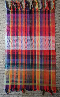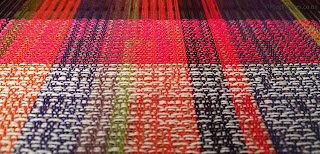
Wednesday last week, I got a big sample off the big loom. There are numerous factors/issues/points of interest in this piece I don't know where to focus, but I should start somewhere. Some contents in this post also repeat what I wrote
here, but I'd like to include all pertinent information here. This is going to be a haphazard post, because I haven't finished observing, but bear with me.
* After the trouble and repairs of a year ago, the loom works, but shaft lifting feels slower, dropping even more so and erratic. I press the foot pedal to lift the shafts, and take my foot off it for the pedal to return to normal position and the shafts to drop, but sometimes the latter doesn't happen, so I must press the pedal with my heel, forcing it back into position. It's annoying, but I can tolerate because this is a two-shuttle weave, and my mind is on colors. I would be silly-crazy to attempt a one-shuttle weave until this is fixed, though.
* About halfway into this sample, I got accustomed to my new foot stool and anti-fatigue standing mat; and perhaps because the shaft movement is slow, I can walk comfortably. I weave looking down on the web from a higher position than weaving seated, and can reach the selvedges comfortably. This is 53.5cm on the loom.
* The warp end colors/numbers and pattern shaft threading are as "random" as they can be, i.e. I had no plans and selected/assigned them on the spot.
* I used Shafts 1-3 for diamond-shaped tie down; Shafts 4-9 for pattern; that's six shafts for pattern, the same as on my sample table loom on which I've woven my previous "random" tied unit weave. If/when I thread another tied unit piece, I would leave an empty shaft between tie-down and pattern sets. While threading, I sit between the shafts and the back beam, i.e. I am threading from the back of the shafts with Shaft 16 nearest me, I might use the highest numbered shafts for tie-down and lower numbered shafts for pattern. This loom has a big shed, so this is feasible.
Colors* There are two rules/guidelines regarding colors in weaving I never bought into. One is, when in doubt, use black weft. I don't; black kills the warp, except in limited context. I use charcoal gray, navy, or dark purples, if I must, but prefer to find colors that make the most of warp colors. The other is, red and green make mud. I've found this to be untrue; the right value/hue/saturation combo or proportion make them sing in harmony. For some reason, my two dissents rang louder and clearer while I wove this particular sample.
* In spite of my dissents, I still find these warp colors and numbers/placement/distribution difficult, (unattractive?) and wonder if I should try harmony, (yellows? oranges?) or control/suppression, (saturated green, teal, hot pink.) I feel ambivalent about purples. While sampling, I was partial to controlling and looked for strong, saturated pattern wefts, but looking at it now, I should also try another piece with more harmonious pattern wefts on the yellow half of the color wheel.

* This next point relates to texture, below; as I wove I
was amazed how much the 60/2 tie down wefts contributed to the overall
color, how much I could see them, so much so I tried three contrasting tie down wefts against some pattern wefts, but after wet finishing, they
disappeared from the A-side, (the side I see as I
weave,) while they show up aggressively in some parts of B-.
* There are still many aspects puzzling me regarding colors, but I think I'll make selections more or less spontaneously as in the past.
These are 60/2 for tie down. I don't have a lot of saturated colors, and no blues, so I wound everything from purple to yellow, and selected pale greens of various descriptions. I have many more of these "raincoat" colors, and a couple of greys, black and white, which don't interest me in this project.
Many/most of my 20/2 are saturated, and I wound every color I have.
Wet Finishing
* My observations become ambiguous, but bear with me. From left to right: 5-point diamond before rethreading this warp from last year; 4-point diamond from a sample woven on Klik in 2015-ish; and the latest. I can't see the three-point diamond in the latest sample. As well, I beat as hard as I can when weaving cotton, but now I'm uncertain if the beat is gentler when I weave standing up on the big loom vs. seated when I'm pulling the beater towards me, or on the table loom.
* Above the fold is B-side; below, A-side. The pattern weft expands so much in wet finishing, the tie down wefts become invisible in most places, the exception being the skinny stripes at the top, where it's too visible. These are
not wrong wefts in wrong sheds, and occurs only on B-side; corresponding A-side looks normal. Having figure that out, I wonder if this is caused by the beat, wet-finishing, or different characteristics of the looms and how I weave on them. But then it could simply the number of pattern shafts lifted at once. [Insert crazy-face emoji.]
On the left is a section of
Sunflower I; the right,
the purple piece I once gave a spiffy name to but now can't remember, both woven on the sample table loom. Tie-down wefts, in comparison, is visible IRL but not excessively so.
*
My cotton pieces are wet-finished inside/out of laundry bags, in
hot/warm/cold water, in regular/quick cycle in the washing machine.
Sometimes it's steam pressed right away; sometimes line dried, then
pressed; sometimes not pressed. Writing this, I realize how inconsistent
I've been, so I'll stick to the same options from now on, once I figure out which are the best. Wet finishing and the beat influence the appearance, in particular of the pattern wefts,
but I haven't noticed any difference in the texture/hand of the cloth; all the samples and two finished
pieces feel more or less the same.
Scale/Proportion* This is a simple idea I'm having difficulty putting into words. In wider pieces as in the current warp or
the abandoned 2019 piece,
I prefer to make the smallest design cell/unit larger, while narrower pieces can stand smaller design cell/unit. What I mean is, on wider pieces, the cloth/scarf as a whole looks more attractive when we can see the design
from some distance.
In the same abandoned piece, the design cells are enormous. They don't have to be as big in this warp, but have a look.
The white pattern weft area, from the bottom, (but ignore the very bottom 2cm,) lifting three pattern shafts for three pattern repeats; two for two, and one for one. And this is only half the width of the current warp. Because of the white weft, the one pattern shaft for one repeat is visible, but depending on the weft color, not so much. I'm not saying I won't do small, but the bigger cells' visibility make the cloth more immediately attractive, even. (or especially,) with, weft colors closer to the warp.
I
am not rethreading this warp again, so what this means is, as a general
rule, the design in this project may be more effective if 2, 3, or 4 pattern shafts
are lifted at a time, rather than 1 or 5.
And the pattern lift should be more than four times "consecutively"; e.g. in a repeat of:
1+2+3
, 1+P, 4+5+6+7+8+9,
2+P, 1+2+3,
3+P, 4+5+6+7+8+9,
2+P
P should be, say, 4+6+7 for all four pattern lifts, or more. This
is great because I have fewer "good" options to
consider, and making of lift plan files simpler.
Having written this far, I'm not convinced I really believe what I said. The wearer can
still enjoy cell-level design up close, e.g. one pattern shaft being lifted for just once.
This is a big design on a Sunflower warp sample. It's not unattractive, and I'm not against it. Here I tried two/three? pattern lifting/colors for every tie-down lifting, so I needed it to be bolder so I can see.
On the same warp, I tried smaller cells/units. Sometimes, depending on the context, changing pattern shafts too quickly look like a lifting mistake.
Even the abandoned project with enormous design cells had some interest close up, but it's not enough!! Now I'm wondering why I didn't stay with this because I can see merits. It took
forever to rethread and make
Hellebores, which was wonderful, but just saying...
EDIT, Oct 6: In terms of scale, I'm also re/considering how few picks of a different/contrasting color I can include and make it effective. I'm currently weaving a few samples to try out wet finish options, so I'll try that out in different contexts. * * * * *
So
far, this is what I learned from this sample, but I'm sure there's more to it, while a lot depends on my preference. My mind is still muddy because factors are so interrelated. Worse, I have a lot of tied unit samples and I can't say anything is definitive/consistent, except I beat hard on the sample table loom. (I hope I didn't jinx myself and start to go soft there.)
What
next? Making lift plan files. I'm trying to retain the
randomness/spontaneity of the table loom, making shorter files to mix and match. I may also weave a couple of samples to experiment with the different wet-finishing options.


