I needed a catalyst to shove me beyond reminiscing about Randy's workshop, and I found it!
Bookbinding is something I've been interested in almost my entire life; it certainly predates weaving and floral arrangement, and possibly chocolate, but I kept putting it off. I finally went to a workshop this weekend, and had a great time, and it was oh-so-well-worth the wait.
Ex-weaver and now book binder Ann Bell of Hamilton was invited by Marlborough Weavers and ran a tight two-day workshop in Blenheim, and in one weekend, we made four types of small notebooks and a slip cover. She brought some achingly beautiful papers made into pre-cut kits we were to choose from. I chose an elegant gold-and-black kit, and almost everything worked out wonderfully. When I was working on the last crutial part of the last notebook (the partially concealed gold one), almost everybody else was finished and starting to clean up, and I rushed and it turned out less than perfect, but when I do it again, it won't happen.
It was a great lesson in how to run a workshop, too. Ann was incredibly well-organized, and the pre-cut kits guaranteed all of us will come away with a beautiful set, but we picked up how to prepare our own kits, too. I've had ideas on combining weaving and bookbinding, but now I know how to do it. And there will be another workshop next year. Yay!
If you are interested in Ann's workshop for your group, email her. As for me, it's time to start panicking about the exhibit; I have 90 days before it opens. Yikes.
Weaving, Trying to Make Sense of my Time at the Bottom of this Planet, Occasionally Tending our Sisyphaen Patch
by the Goddess of Procrastination and Expert Forgetter
2006/10/31
2006/10/30
A Very Sorry Randying
I had put on a burgundy merino warp on the Jack loom for four short and narrow scarves before the workshop. Last week, I finished Scarf 1, and I couldn't resist, so I tried Randying on Scarf 2, but was GREATLY hindered by my limited color palette (that is, almost a complete lack of green/yellow/orange half of the color wheel!) Because I wanted to wear it as a sample, I started out by using only merino, then wool roughly 110/2, (in an attempt to keep the shrinkage even) but after a while anything went.
I must reorganize my wool room so I can Randy better, and I probably need a shopping spree. But here are some embarrassing glimpses of Scarf 2. Scarves 3 and 4 were finished in various Burgundy possum-merino-silk yarns, wonderful to the touch, but I admit, a bit shy of attractive. I hope I can do a bit better than this the next time.
2006/10/26
My Colors
The second reason why I love Randy's work is I love his clear, crisp, honest, straight forward, but sophisticated American colors. And I call them American colors.
Colors are subjective, and for example, my mother thinks Randy's colors are Asian. In fact, he was at one point influenced by the wonderful Japanese weaver and dyer (and Mom's hero,) Shimura Fukumi, so maybe his colors are Japanese/Asian. I can also see different artists and paintings in his different cloths, and naturally Randy's colors change from warp to warp, over time, depending on the weave structures or the intended end-use of his textiles, and ultimately, his whim. I have no clue what kind of impressions his textiles give you, because that depends on where you've been, what you've seen, and what you like. And I don't intend to oversimplify and say, "Randall Darwall uses American colors." No way. But it's the way I see his work.
I lived in Minneapolis, a colorful part of the Midwest of the USA for 10 years off and on, and in Tucson for a year when I was a child. I lived in Auckland, New Zealand, a sub-tropical paradise, for two years, and have been in Nelson coming up to ten years. The rest of the time I lived in Yokohama, Japan, very heavily polluted but with distinctive seasons, and more importantly, seasons and colors deeply embedded in the everyday language and thinking, as cultural codes. So I daresay I have lived in three distinct color cultures.
Now I'm getting deep into an extremely subjective territory, it's like walking on stilts in a swamp after heavy rain, but I'll give it a try.
If you look at traditional (say, pre-1970's) kimono, most design patterns have meanings and names, and are associated with specific season or occasion and color. For example, chrysanthemums are mainly yellow or gold or white, though small mums can come multi-colored. Certain patterns should be worn only during certain months, (regardless of what the weather is really like,) which means the design can dictate the fiber: goldfish; summer; casual cotton, or even silk, but probably not wool. Certain patterns are associated with occasions, e.g. the decorative cart, crane or turtles are good luck, and are worn at weddings, and out of respect for the occasion, the fiber is silk (or synthetics nowadays) but almost never cotton. If you are a fan of Haiku poetry, you'll know about the use of "kigo" or seasonal clues; you get the gist. (Though I understand it's not compulsory in Western Haiku. )
So we grow up with these subconscious interconnection of patterns, seasons/occasions, colors, and fiber, (codes, really) and we need to keep these in mind when, say, putting a set of kimono and accessories together to wear to your sister's wedding. Traditionally a different set of priorities came into play when determining color combinations; one can easily end up with horribly mismatched (in my modern day opinion) colors and over-the-top combination of patterns, embroidery, textures, (ditto). Thank goodness the cut of the garment is simple.
Again, traditional Japanese colors, other that the special-occasion gold, orange red, purple, white and black, are often not saturated but tints (hue + white) or shades (hue + black) of various values, partly because of the available natural dye material, partly because of the overcast weather we often get, but also because these nuanced colors are considered personable, ergo desirable. So, muddy colors, bad combinations, too much cultural baggage, for me. (Modern colors are another story for another day.)
I don't have a firm enough grasp of New Zealand color schemes, but I do see more warm (the yellowy, compared to the bluey) colors, based frequently on nature, and lots of shades. I'm starting to appreciate oranges and yellow-greens in the last few years, especially in combination with purples, but the underlying color schemes are a mystery to me, and again, the in-betweeness (to me) of the colors, the muddiness, I find unattractive.
Now to American colors. I realize the US is a big country and there are different climates, cultures and people, so what I think of as American colors are not the only colors or schemes present in that country. Not at all. (And among other things, Internet shopping takes away the traditional national borders, I know!) But what I see, in contrast to MY Japanese and New Zealand experiences, are what I describe as "clear and crisp" colors and combinations. In some instances, they are true to the original value of the given hue, and they may be more intense/saturated. But more importantly, I think I unconsciously understand why they are put together, and am naturally sympathetic, and that's why they are "honest and straight forward" to me. I simply love them.
As regards sophisticated, well, I learned in class that the narrow range of values over a wide range of hues make it so; that I can explain.
Randy made me feel at home with colors, and I want to investigate colors and dye my own yarns. But there is ALWAYS more to Darwall textiles, and I'm going to have many more "A ha!" moments in the decades to come.
But for now, I need to stop looking back and start my apprenticeship.
A Weaver's Repressed Memory
I'm still having a hard time coming back to terra firma, so I appreciate other weavers letting me know what they are weaving, or rehashing discussions from the workshop.
One told me she didn't want to be a Randiette, and then apologized for sounding disrespectful. Not at all. I expect many of my classmates would have been weaving for 20-, 25- or 30- years and have their own styles, and at any rate, workshops are to enhance one's work, not necessarily to emulate. Sticking to one's own creative direction is part of New Zealand's national psyche, and as mad about Darwall textiles as I am, I don't aim to reproduce his textiles even if I could. Nevertheless I was smittened by his work, and here's one reason.
Between 2000 and 2001, I tried spinning, dyeing, and other skills most weavers know and use to enhance their textiles. Back then, I told myself, "These are interesting but I need time to investigate, so I shall come back to them when I feel more comfortable/competent about my weaving."
To my shock/horror I remembered while recapping Randy's workshop that I made the same decision about colors one afternoon in May, 2001. That is, in my eagerness to improve my weaving technique, I needed to eliminate all "distracting" elements/components, and thus I started to weave with and buy only navy or otherwise blue yarns. Methodical but mad. What's worse, I continued to buy navy and blues, plus a small assortment of undyed, white, black, gray, (all with no or little hues, and more recently, reds,) and forgot that the colorless purgatory was mean to be temporary. Colors used to be my single most favorite part of weaving until that fatal afternoon.
Now that I'm also interested in texture and weave structures, I will keep weaving my monotone cloth, but it's time I resumed playing with colors. That's part of my apprenticeship.
2006/10/25
Dianne Dudfield, Post Randy, No 1.
Dianne writes: The warp is what I took to the workshop. The weft goes bottle green, pinky purple, then murky blue, teal and an apricot/orange. Colours I use quite often but I would never have used on said warp pre-RD so even though I can't get the "use 50 colours" bit (yet) I am trying new adventures. Also put in 4 thick boucle threads in a green, navy and bottle and lurex combination and crossed the warp with that at intervals as well. The frost crystal pattern shows up well after washing and wished I had persevered with it more. I'm happy with the result.
The threading is called Frost Crystal from a Weavers magazine, but not an exact copy. This is also pictured in the new book on twills from Weavers magazine. The wee pattern bits are woven straight draw and the longer pattern is woven 5-end advancing. I'm very impressed at how a weft can disguise a not so attractive warp and make an acceptable creation."
Acceptable? I think you underestimate your piece, but your warp was a very soft, gentle collection of greens and blues, from memory, and I like that with weave and colour, you have put in some sharp-looking areas as well as the soft blended areas. Thank you, Dianne.
2006/10/24
I'm in the Book
Remember I was moaning about the cost of being a member of the arts community, and then the whole hoo-hah about having my work photographed by a professional photographer? Well, Nelson Arts Guide Book is finally out, and I am in the book now. (Click and zoom, or get your magnifying glass out!) I'm on Page 177.
When I went to pick mine up at Arts Marketing, Martin asked me how I've been, in his usual "interested!!" way, and I noticed of late I give a list of my ailments in response. So, Martin, Alex and Julia, the revised answer is: "The body is creaky but the mind is bursting, because I just came back from five days with the best living weaver of our times; he's the Coltrane, he's the Ansel Adams; I am a changed weaver!"
2006/10/17
2006/10/16
Randall Darwall Workshop - My Samples
So, what did I learn at the workshop? I think control and planning make predictable but not necessarily interesting cloth, that I've not enough experience not to be experimenting more, and that I may find weaving more enjoyable in a different way if a bit of spontaneity came into play. Here are my samples to illustrate the point. (The colors on these photos do not represent the samples very well, unfortunately.)
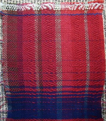
Sample 1a: on my own warp; we practiced weaving picks according to the Fibonacci number, in two colors. In this sample, I wove: 55 red, 1 blue, 34 red, 1 blue, 21 red, 2 blue, 13 red , 3 blue, 8 red, 5 blue, 5 red, 8 blue, 3 red, 13 blue, 2 red, 21 blue, 1 red, 34 blue, 1 red, 55 blue, in roughly similar value, but the blue yarn was much skinnier so the visual proportion is lopsided ; we also ignored different shrinkage.
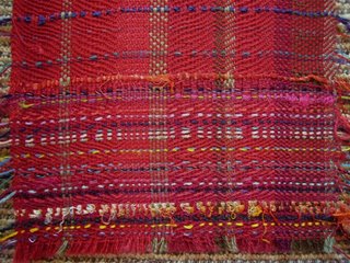
Sample 1b: on mine again, Randy instructed us to maintain the visual proportion, but start introducing other colors and textures and aim to mix 100 colors. As you can see, I did weave a lot of red picks, but I was not exactly adventurous, and was afraid of introducing drastically different hues at first. In fact, I was totally frustrated.
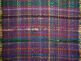
Sample 2: multi-color warp mostly in darker values. I started out resisting, in thin purple wool, by telling myself I needed to get used to the loom. However, I was also highlighting the paler colors, especially yellows and oranges, and also included some textures. When I ran out of the purple wool, I switched to a thicker green cotton, which made the cloth more bumpy/textured, and the cooler contrast less noticeable.
Although you can see that I am still counting, with the purple and green as main colors, I was less inhibited in introducing hues because many already existed in the warp. I like the inclusion of lavender, violet and olive green in the purple area.
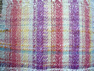
Sample 3: a textured warp. Because of the texture in the warp, and the type of weft yarns I had with me (smooth, thin wool and embroidery floss in various colors), I thought this is a test in how much I can show the weft yarns. In fact, I got braver and started to include intense yellows and oranges, as well as two powder blue-greens, although most other 'interjections' were hues similar to those found in the warp, but in different values.
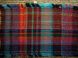
Sample 4: a warp with contrast in values. I found the wide range of values in this warp difficult, and chose an orange (a hue I seldom use) roughly equal in value in warp, to see what would happen. I did this because my natural instinct would have been to use navy as the main weft , which I tried only to get used to this loom. I was more interested in what would happen to the cloth value-wise, and was able to ignore the disharmony (to me) of the hues. Although the finished cloth does not reflect this, I was starting to think on my feet and foraging through my, and other weavers', stash for different yarns.
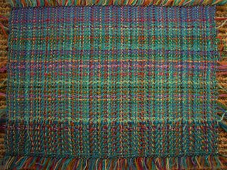
Sample 5: gentle blues and greens. I felt liberated weaving on this warp, because the colors are so different from what I normally choose, I had less preconceived ideas about what I should do. Although I did not know this at the time, I was no longer overly concerned with proportion, being more interested in the evenness of value, and consciously worked on the visual movement i.e. not introducing interesting colors amidst just one base cooler, but moving the viewer's eye. The variety of hues I introduced increased dramatically, and I also used glitter threads.
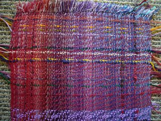
Sample 6: "I wished I warped this" warp. This says more about my preference; I liked all the colors on this warp at first glance, and looked forward to weaving on this loom, but found it difficult. I think it was partially because the value range is wide, partially because I 'know' these hues, and most probably because of the time of the day I reached this loom. Because the warp threads collectively looked very intense, I kept putting in more intense colors, e.g. many embroidery floss, but I carried on with trying to change the base cooler to move the eye, without making obvious stripes. The photo doesn't show this well, but the base colors changed in this sample as in the last one.
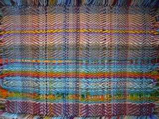
Sample 7: another gentle warp. I was finally starting to feel comfortable about going with the flow, not worrying too much about proportion or value, but just wanting to move the eye and avoid stripes. I was, however, starting to run out of some hue/value wefts, so my options were narrowing, and this proved to be a great exercise because I had to use more and more hues I normally would not touch (nor own).
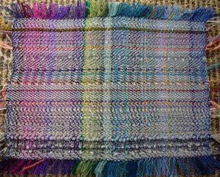
Sample 8: My Randy. By the time I arrived at this loom, I had some clue as to how I could transfer my ideas onto the cloth. We had just seen a series of Randy's silk scarves that morning, and I wanted to recreate the shimmer of silk using wool. I found a shiny acrylic (?) silver/brown/black thread in someone else's basket, so I wove one pick, followed by a dull gray yarn; so two yarns/picks to create one base color 'pick'. Because the warp threads were intense/saturated, for accent colors I used less intense, 'dirty' colors. I was very pleased with the overall look, and the added bonus was the owner of this warp liked it, too.
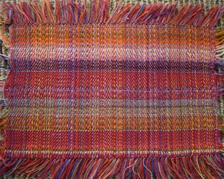
Sample 9: I am Randiette. By this time I was enjoying thinking on my feet, and was not worried about doing the wrong thing. Here, although I tried to avoid obvious stripes, I was more interested in the movement of the viewer's eye, and I did introduce more yarns than in almost any other sample. The interesting thing about this sample is that depending on the distance from which you view this sample, the stripes appear to be of different width and/or the border of the stripes move.
So what did I take home from the week? Well, actually it didn't occur to me until I analyzed these samples: Randy was spot on with his advice on the first day, that I cannot go to workshops looking for a magical formula to improve my weaving, but I need to be my own apprentice, weave more, and learn from experience how to use colors and what kind of cloth I want to weave. What makes him a great educator is he probably knew I would automatically reject his advice had he used words like "play" and "spontaneity", but I don't mind working long and hard, and what a romantic notion to be my own apprentice! That was my magic formula. So now it's time to get on my loom and weave.
2006/10/14
Randall Darwall Workshop - Post Script
I didn't set out to be a chronicler of the workshop, but it turned out I did a little bit of that. I can kick myself for not having learned all my camera is capable of before I went away. I regret not having shot a group picture of the class. But, at the risk of offending a few mild-mannered Kiwis, I do have one last, last story I want to tell.
See, Kiwis don't get too excited, and they are not a demonstrative lot. So usually when someone is leaving a party, the best you can hope for is for the host to come to the door to say good bye, and turn on the outside light if it's late in the evening. When Randy and Brian were leaving, we all followed them to their car and waited politely for them to finish hugging and shaking hands with people not from our class, when one weaver mumbled, "It's too bad we can't do a Haka or something."
That was singularly the most explosive outburst of respect, love and appreciation I have ever heard in my 12 years in New Zealand, and I can't think of a better way to express how we felt.
It was one heck of a screamingly gorgeous experience.
(Maori Haka is traditionally performed by men.)
Randall Darwall Workshop Part 7 - Reflections
Clearly, I am unwilling to depart from remembering and reflecting on the workshop, but a workshop is only good if I have fun, and worthwhile if I can use the new knowledge in my work. So I must get downstairs and back on my loom so I can show you what I've learned.
But here's one last story I want to leave you with, for the time being. (NOTE: I'm a visual person, and as hard as I try, I'm no good listening to words, even if the August Randall Darwall is reading or telling stories close to his philosophy and aesthetics. Unless I have the text in front of me, my mind wanders and tries to visualize what I'm hearing. So I'm missing some important details, but you'll get the gist.)
Randy was fresh out of Harvard with an Art History degree, and found himself teaching art to 9th graders (15 year olds). One day, he read something, which made him realize that his task as a teacher was not to discover and encourage the one or two in the class who "got" art, but to convey to all his students, in whatever level each student was capable, the joy and appreciation of living with art. Or something like that.
I don't know about you, but it seems pretty incredible for a young chap in his early 20's to have this kind of maturity and generosity, and he's been doing it to different audiences ever since. And that's the kind of man he is. We were lucky to have had a chance to study with him. His teaching transcends weaving.
Randall Darwall Workshop Part 6 - A Sense of Play
Throughout the workshop, Randy also demonstrated to us how simply discharging colors from areas of commercial yarns, fabric, and warp on the loom can create added interest; he just sprayed diluted household bleach and then rinsed (not the warp on the loom) them. These can be further dyed to create even more complex material. I didn't photograph the yarn and fabric he used in the class, but his vest and shoes had gone through these processes, and were made unique and personal.
Oh, don't use bleach on silk.
Randall Darwall Workshop Part 5 - Collaboration
Randy stresses that his is a cottage industry; he has weavers, garment makers and Brian for designing, marketing, and other creative collaboration. I asked when Randy threw a shuttle the last time, to which the answer was an astonishing "10 years ago".
With his scarves, Randy himself dyes the yarns, then chooses the colors, the proportion, and the threading (which thread comes first, second, etc. and what weaves can be woven). His warps are relatively short, around three scarves, and then he assigns a weaver to this warp. They have a brief discussion on the general idea, and the rest is left to the weaver, sans plans, schedule or draft, to choose and change weft colors and weaves as she desires. (I'm pretty sure all three weavers he mentioned were women.)
So the Randall Darwall scarves are, in fact, a brand and a product of collaboration.
And that got this lone, basement weaver thinking; is the complexity of Randy's textile achievable only through collaboration, or is this something that can be learned and planned? I hate to have to give up the solitude of my work, but I would love to incorporate/simulate the results of "many hands working".
"What about this with this?"
2006/10/12
Randall Darwall Workshop Part 4 - What About the Dynamic Part?
I'm still not sure what exactly he means by "dynamic" in "dynamic proportion"; that the numbers (percentage) change seems too simplistic; I'm willing to bet it's more than that. (Warning: we are getting deep into my own interpretation.)
If you choose pleasing hues with value in mind, and pay attention to the amount of each and placement, one can create a kind of cloth where the eye travels over the surface of the cloth, on the strength of the colors alone, (rather than relying on the weave structure, which is how this is more commonly done.) Ergo, "dynamic".
Randy didn't use the word "dynamic' in the workshop. Instead he repeatedly told us to weave in a "painterly" way, to surprise him, and used many beautiful musical metaphors. I'm not sure if I'm placing too much emphasis on the one word that bugged me for months, but I can see when it's working.
Randall Darwall Workshop Part 3 - Dynamic Proportion
This is arguably the most important concept of the entire workshop, and in understanding Randall Darwall textiles, but today, I found nothing on this in my notebook, and no smashing photo to illustrate it. But I'll give it a try.
A few months before the workshop, Randy wrote to us explaining how he wanted us to prepare the warp to bring to the workshop, and in it he wrote: "Color: more is better. I often use the phrase 'why use five colors when fifty will do nicely.' Dynamic proportion is an important element here: try picking a base color and then adding smaller and smaller amounts of different colors to it."
At the time, and until I arrived at the workshop, I struggled with the concept, as I could only visualize a fat navy blue stripe next to a medium-width cyan stripe next to a skinny baby blue stripe. This isn't entirely wrong, but oversimplified. His concept is to use colors in nice proportion, but not in direct alignment. And to this end, the Fibonacci numbers could be a good tool. For example, I could weave a narrow scarf with 136 ends (warp threads) and six colors in the warp: to do this, I wind 55 ends of color A, 34 of B, 21 of C, 13 of D, 8 of E and 5 of F, but not necessarily in that order, and the numbers need not be exact, so I could even be whimsical and add 2 ends of color G and 1 of H. Likewise with the wefts when I weave.
The theory is, unless I'm all over the place in hues or value, the scarf as a whole has a cohesive look, yet with plenty of interest. At least that's how I understood this.
2006/10/11
Randall Darwall Workshop Part 2 - Values
Most people know the language of colors, understand it, or can explain it better than I can, so I'll be brief.
What we normally call 'color' refers to the hue, (red, yellow, green, etc., found on the color wheel), but there are two other parts, value (light/dark) and intensity (brightness) which also come into play; we didn't get to intensity, so we'll ignore it.
I love to weave what I call, "roughly monotone" textiles, mixing almost identical hues but with slightly different values, or textures. (Not sure if values relate to textures, so any help is appreciated.) I believe the weave visually comes to the fore this way.
What I find most attractive about Randy's textiles is when he mixes many hues, but within a relatively narrow range of values; so, many colors, but about the same lightness/darkness. This creates a shimmering, elegant effect that gives the textile a different kind of interest than my usual textile. Take a look.
The problem I've always had is I don't see values. I can distinguish black and white, but not the subtle differences of the shades of gray. I have 6-, 10- and 12-block gray scale things with little holes; I have the quilters' red and green plastic sheets; I have squinted and looked under the moonlight, but I just don't see it, and I'm happy when someone tells me A is darker than B. I'm value-blind rather than color-blind. So one of the goals Randy thought I should aim for is to experiment more with colors and develop alternative ways to understand value relationships, so I can weave cloth that shimmer.
2006/10/10
Randall Darwall Workshop Part 1 - Overview
It was like Christmas. But better. We waited and waited for the whole year. And then it finally happened. For six exciting days, our two Santas greeted us at 8.30 AM every morning and we got stuck into the magical world of colors (and values and proportions, but more on these later).
The most surprising thing was both Randy and creative collaborator & life partner Brian Murphy were such nice people, (was I expecting cantankerous East Coast artistes?), as were my 11 fellow weavers. So the week passed in an encouraging, cordial camaraderie. (The weather was glorious and here is Brian plotting to get away for a few hours of bike ride.)
Randy gave us personalized goals during our Show & Tell, and pointers and encouragements throughout the week, as we worked our ways though our own warps, and six inches each on 11 other looms.
Five days of theory and practice culminated in the critique sessions on the last day, when we took the samples off the 12 looms and analyzed each piece.
Bittersweet graduation; I wanted to keep going for at least another week; I wanted to keep these two guys. (Waratahs are Australian, Brian.)
Randy and Brian drove off into the distance (Taupo, to be exact) shortly after this, while we reflected on the excitement of the past week. Unlike Santa, Randy and Brian won't be back next year, but we were given presents we would treasure for years and years to come.
Subscribe to:
Posts (Atom)